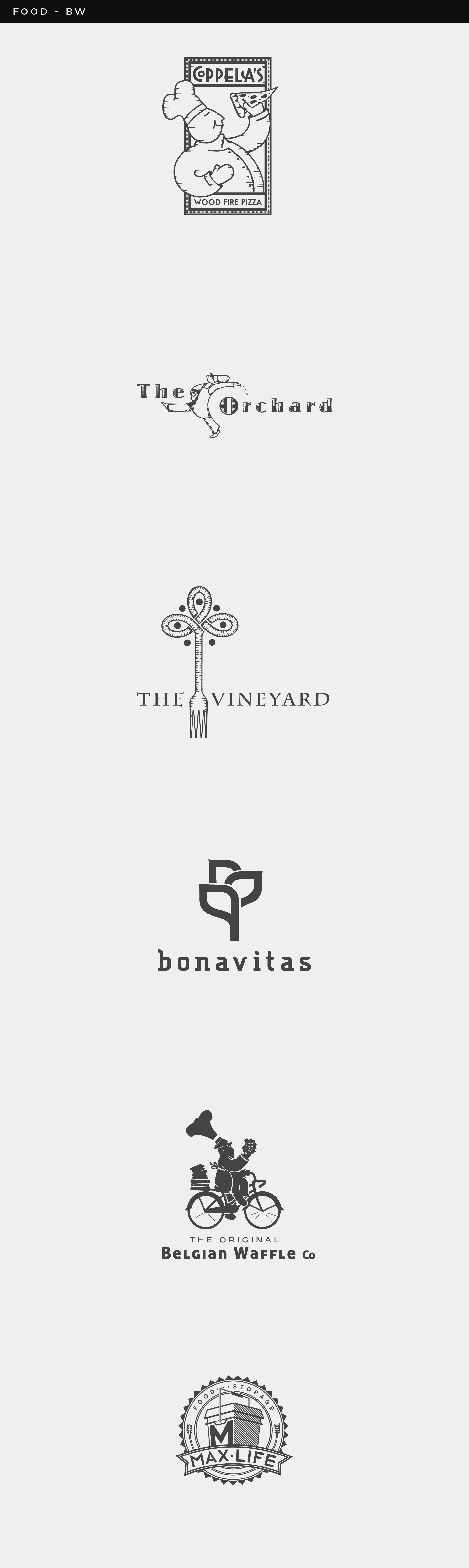
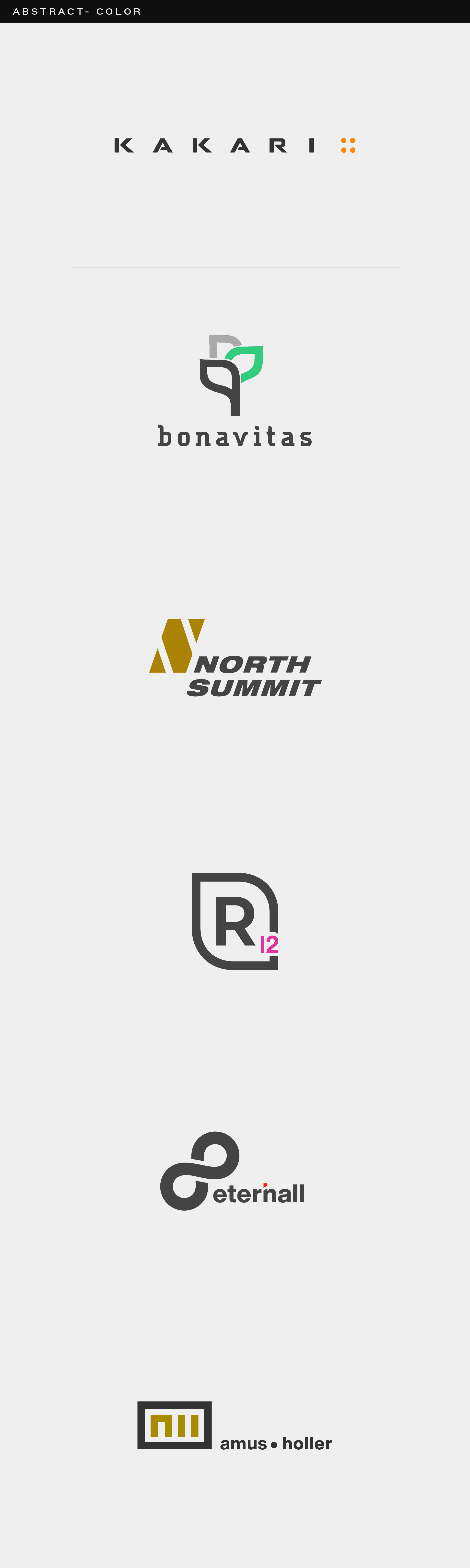
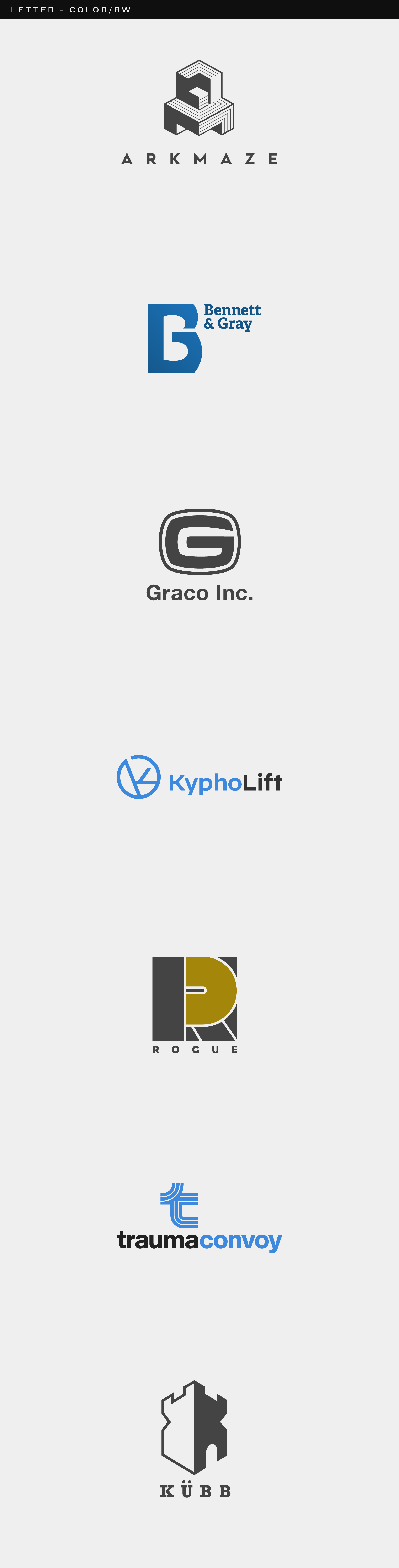
A curated collection of logo work spanning years of practice, exploration, and refinement. Each mark is intentionally shown in black and white — rooted in the belief that a logo must function at its most stripped-down before it can earn its color. That constraint is a filter. If it doesn't work in black and white, color is just a distraction. Every logo in this collection is built on three principles. The first is concept — that elusive moment where the viewer leans in and thinks I didn't see that at first. That kind of discovery only comes after exhausting the obvious ideas. Hundreds of thumbnails. Hours of sketching until the brain starts seeing negative space as positive and simple lines start suggesting something unexpected. That's where the real ideas live. The second is DNA — the invisible thread that makes a logo feel intentional. Consistent curves, corners, angles, and spacing. A shared visual language between the mark and the letterform so that every element feels like it came from the same place. Two beautifully designed pieces that don't speak the same language will never add up to one great logo. The third is execution — the part that separates good from great. Moving a line three pixels, sitting with it overnight, and moving it again. Choosing optical alignment over mechanical when the math is right but the eye says otherwise. Not rushing. Ever.
Compilation
Logos
Multiple

